What is Contour Plots?
This feature creates a series of response surfaces in the form of colored contour plots, based on data from the currently selected results tab containing scenario inputs and end-point values of plotted responses.
New in Dynochem 6, you can visualize responses on animated contour plots, allowing response surfaces with more than two factors to be visualized easily. Just use the new slider bars to move through values of the factors that are not plotted on the horizontal axes. Or press the play button to watch a 'sweep' over the whole range of those factor settings. You also have more control over the colour ranges and colour palettes used for contour plots.
How can I use it?
In the typical case, you select two factors and one response to plot. This generates a single response surface whose base case values of all factors are those in the first listed scenario. The horizontal axes of the contour plot will contain the varied values of the first and second factors respectively. The vertical axis (coming out of the page) and contours will indicate the values of the selected response.
In a more complex case your results tab may include variations of more than two factors and you will request plots of more than one response. In this case, this feature will generate several plots, displaying each selected response versus each pair of selected factors. Once again, the base case values for all factors will be those of the first listed scenario.
The plots will appear as a new webpage in your default browser. Each plot contains a set of controls that allows you to:
- generate a consistent, accurate image of the plot for use in reports or presentations
- read off values from the plot
- zoom the plot.
The webpage is stored in the same folder as your Dynochem model.
Examples
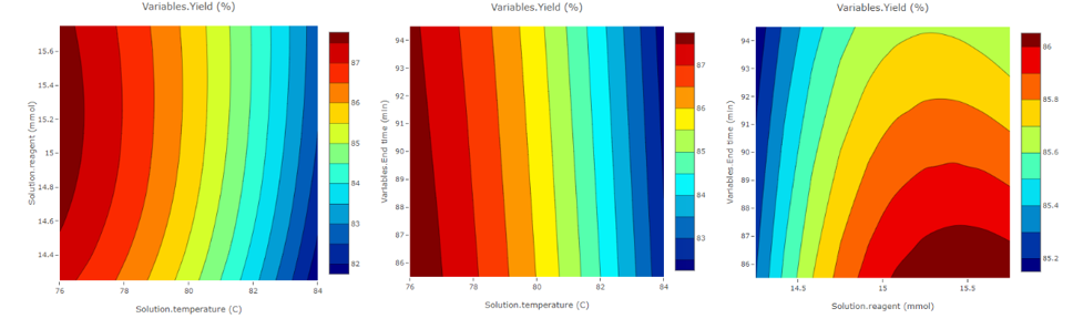
Example 1: homog_consecutive: Effect of temperature, reagent and end time on the product yield
Contour plots were created after a Full Factorial analysis on the homog_consecutive model in Dynochem resources, where temperature, reagent and end time were varied. The three contour plots generated were
- Effect of varying the temperature and reagent amount on the % yield
- Effect of varying the temperature and end time on the % yield
- Effect of varying the reagent amount and end time on the % yield
The contour plots from the example above are shown below:
You can generate an image file from the plot using the camera icon:
- Hover over the plot to show the toolbar containing the camera icon.
- Details of image generation vary with your browser. Click the camera to generate either a PNG (Chrome or Firefox) or an SVG (Edge or Internet Explorer).
- Open (or if prompted, save and then open) the image file and right-click the image to copy it and paste in Word, Powerpoint, etc.