Fitting history
The Fitting history is available in the Excel and web fitting reports after a fit has finished successfully. This contains the parameter values and SSQ (or Chi-squared) value as a function of iteration number. The SSQ should drop as the iterations proceed (indicating that the fit is improving). Once a good fit is found both the SSQ and the parameter values should level off (i.e. not change significantly with iteration). A flat section on the graph is normally due to:
- Automatic restarts. If automatic restarts do not find a better fit when checking for a local minimum, the SSQ and parameter values will not be changed. This will appear as if no progress is being made; however useful sensitivity checking is being done. We recommend that automatic restarts are always enabled, but if you want to disable this feature you can do so in the Advanced Options window.
- Parameter refinement. SSQ could be changing very slightly, so the fitting exercise will not finish, in this case it is likely that the parameters are also only changing very slightly. To reduce the number of iterations, reduce the tolerance in the Advanced Options (click
 to open) panel.
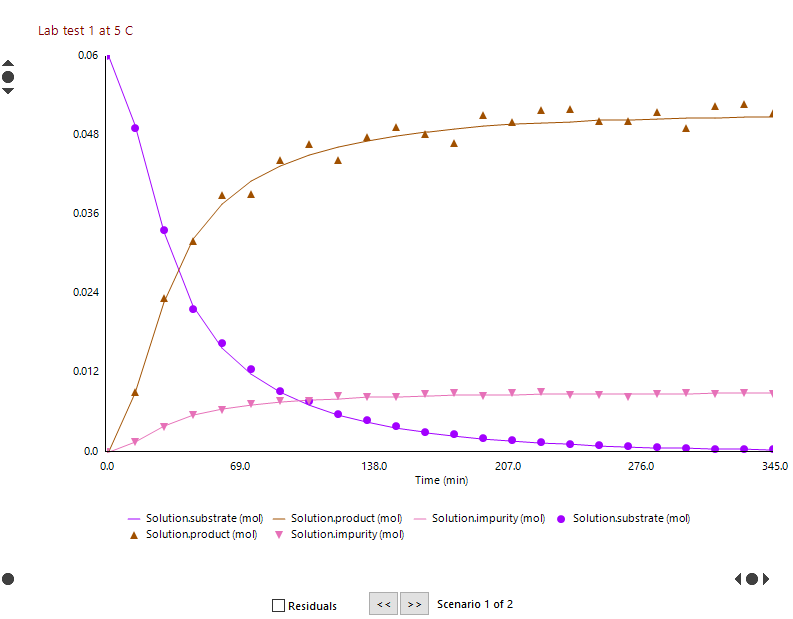
Data vs. Model chart
This chart displays the experimental data and model predictions versus time for each scenario. It allows an alternative assessment of the fitting progress. As the fit proceeds the lines (model predictions) should move towards the points (experimental data) on each scenario.
Only one scenario is plotted on the chart. To view a different scenario use the forward and back buttons (>> and <<) at the bottom right of the chart.
You can change the scale of the y-axis either by using the chart controls on the y-axis or by clicking on a series in the legend at the bottom of the chart.
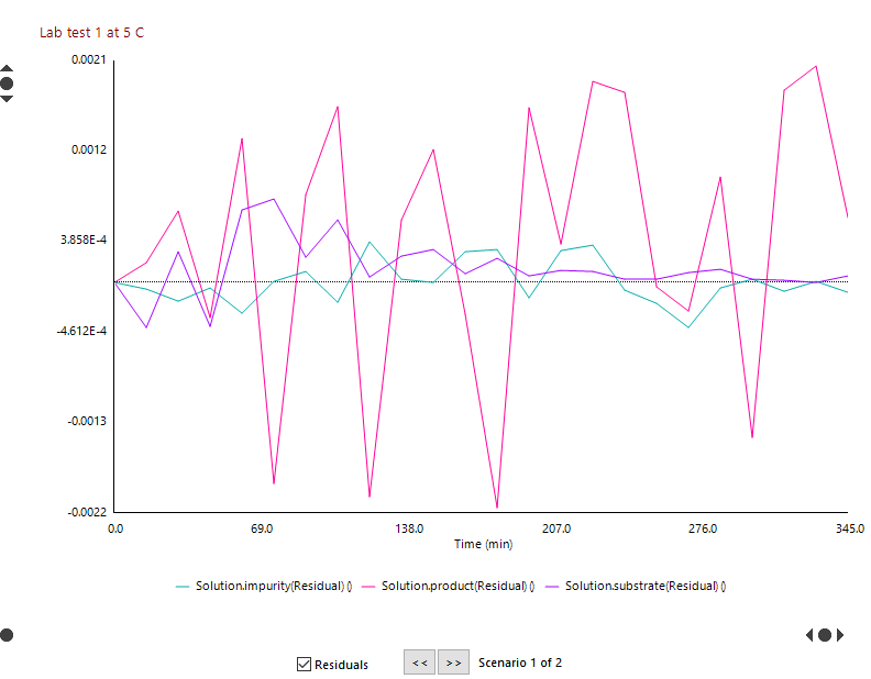
Residuals only chart
This chart displays the difference between the experimental data and model predictions versus time for each scenario. It is only available when a fit has completed.
If the fit is good, the residuals should look random. Trends in the residuals indicate that the model is not adequate to describe the data. Either the wrong type of model was used (e.g. fitting a first order reaction to data collected from a second order reaction) or more parameters are required to describe the data (either fit more parameters, or increase the complexity of the model (e.g. add another reaction).