What is the Charting section?
The Charting section allows you to visualize your data in the Experimental Data section, across multiple experiments and multiple responses in a single interactive plot. An example of a Data Chart from an empty model is shown below:
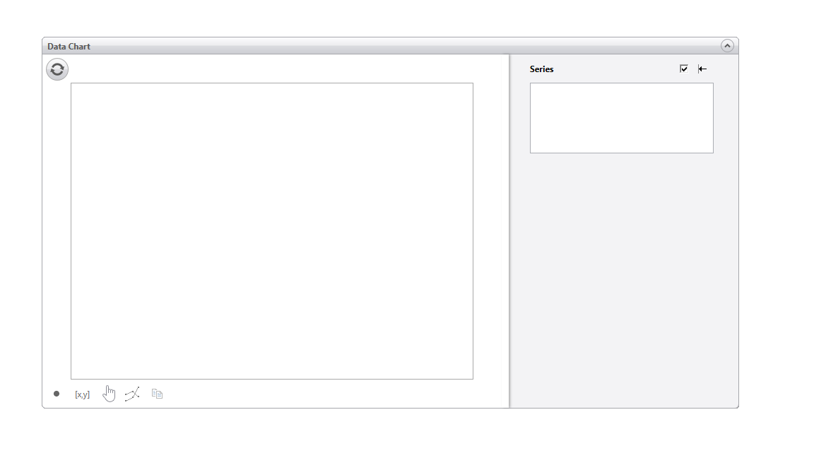
There are 3 main sections in the Data Chart panel: (i) the Chart itself, (ii) Scenarios and (iii) Series. These are described below.

Chart
Click the refresh button  at the top left to read/ refresh the current values for all the data sets or to reset the plot.
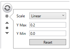
Changing the values in the Chart scale:
If you want to increase or decrease the y-axis scale, use the following button  outside the top left of the y-axis. The top arrow doubles the scale maximum and the bottom one halves it. If you want to reset the chart to the original scale, click on the reset button
  in the center.
If you want to zoom in on a particular section of the chart, click on the pan icon  . The icon will change to the zoom icon
  . Now you can select a portion of the graph that you want to zoom in on.
If you want to pan/ translate the chart, click on the zoom icon to change it back to the pan icon, then click and drag in the chart to pan.
You can also change the chart scale axis by clicking on the axis settings  . This will open the following menu:
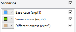
Scenarios
The order of each data series in the chart depends on where it appears in scenarios. The data series name for each scenario is given in parentheses after the scenario name.
This section is where you can select what scenario(s) are plotted. If you want all of the scenarios plotted, check the box to the right of the scenarios title. This plots all the scenarios and checks all of the boxes below this checkbox.
If you only want to plot a few data series, uncheck the checkbox to the right of the scenarios title, and check the checkbox to the right of the scenario/data series that you want to plot. You can also change the color of the plotted series by clicking on the dropdown menu and selecting the color.
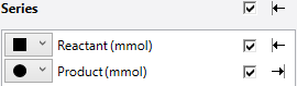
Series
This is the section where you can select what symbol you want to use to plot each data series and whether you want its y-axis on the left/right-hand side of the chart. When you have more than one series selected, the left and right axes will scale independently. Each of these points are described below.
1. If you want to change the symbol used to plot your data, click on the dropdown menu located to the right of the shape,  .
.
2. If you have measured data for two components, say solution reactant and solution product, and you want to plot the solution reactant on the left-hand side and the solution product on the right-hand side, you can use the following arrow icons  . For example, the screenshot below shows that the reactant will be plotted on the left-hand axis, while the product will be plotted on the right-hand axis.